Sunday, February 28, 2010

Praying for you Carolee!

This morning at Church a friend was commissioned on a short term missions trip for 2 weeks to Thailand, she is so excited to go and make a difference there, and her very wonderful husband is keeping the fort here at home with their 3 little ones.  So today when I saw that my wonderful team-mate at ODBD Angella Crockett was the Featured Stamper at SCS today, I found the perfect card to case to send to their family. 

The link to Angie's beautiful card is HERE .  She did beautiful work on a Clean and Simple style card with one of my favourite Our Daily Bread Designs sets Sing to the Lord.  So I did the same!  I kept the basic style and design of the card, keeping the embossing.  I changed the color palette, added a couple of layers, changed it to a smaller A2 size and added Ornare Template piercing and pearls, and a little Dazzling Diamonds on the flowers.


The bird and flowers are colored with copics, and I added some swipes of my Cool Caribbean ink pad over the embossed Euphoria paper.

Isn't it fun how the watermark matches the card :) 

Alright ...off to finish watching this Canada vs USA Hockey Gold medal game!   Have a great Sunday everyone!

Recipe:  Stamps:  ODBD Sing to the Lord;  Ink:  Memento Tuxedo Black, Chocolate Chip;  Paper:  Close to Cocoa, Cool Carribean, Basic Grey Euphoria DSP, Gina K Pure Luxury White;  Accessories:  Copic Markers, Ornare Piercer and Template, Dimensionals, Flirty Ribbon (old SU), Big Shot, Texturz Embossing Template, Glue Pen, Dazzling Diamonds Glitter, Pearls.

Saturday, February 27, 2010

Grow in Grace

We're on week four of our Shining the Light Challenges with Our Daily Bread Designs, have you been having fun?  I hope so, if you haven't joined us yet, feel free to jump on in!  You can find all the details on the Our Daily Bread Designs Blog

This week our challenge is to use a non-traditional fold of our card, I chose to use a Z-Fold which I learned from Val Stangle in the fall of last year.  I just think it makes such an interesting fold and a really elegant presentation.

I used the pretty set called Grow in Grace, and took my color cues from the very fun Basic Grey Sugar Rush Paper.  It has pretty amethyst colors, and gray, orange and greens.  A very spring feel to me. 

The flower is watercolored with reinkers and water-based markers.  I did add a gray wash behind the flowers, but in the picture it's hard to see. 

I added this fun Kiwi Corduroy brad for a pop on the top, and bordered the top and bottom with my Borderabilities templates. 

I added a touch of silk ribbon along the bottom that really adds to the elegance too. 


Here are some more shots of the card open and close up.

Now how about you jump in with us?  Make a card with a unique fold, something a different shape or style - just not an everyday A2 card style, then  upload it to your gallery at SCS or your blog and then link it to our Mr. Linky connection on the Our Daily Bread Designs Blog.  If you have ODBD stamps please go ahead and use them, if not play anyway!   There are great prizes involved for the ODBD store that you don't want to miss!  And if you use ODBD stamps, you might be selected for our Shining the Light feature each week.    
Now you can go an visit my teammates for some more creative inspiration:

America Kuhn, Chris Olsen,  Francie Gumprecht, Natalie Dever, Patter Cross, Sabrina Jackson, and the Our Daily Bread Designs Blog
Recipe:  Stamps:  Our Daily Bread Designs - Grow in Grace;  Ink:  Stazon, Basic Grey;  Paper:  Watercolor paper, Almost Amethyst, Basic Grey, Basic Grey Sugar Rush DSP;  Accessories:  Big Shot, Labels 5 Nestabilities, Scalloped Oval Punch, Borderabilities template, Dotted Embossing Folder, Scallop Eges Punch, Reinkers, SW Markers, Aqua Painter, Dimensionals, Corduroy Brad, Circle Punch, Glue Dots, Silk Ribbon, Bow Easy.

Wednesday, February 24, 2010

A Birthday Blog Hop for Jan Marie!


I'm so excited to be a part of Flourishes first ever Blog Hop, and what a super-special occasion to celebrate that Jan Marie our owner's Birthday!  The Design Team and Friends of Flourishes Team are all in it together!  So fun!

And even more fun, it's a mini-release of a brand new stamp set for her Birthday!  A set I think is wonderful, totally Flourishes but totally different too.  I really love Becky's design style, she brings something totally new to the team.  This new set, called Let Them Eat Cake was designed by our artist Becky Fleck with a Marie Antoinette flair and, just in case you wondered, it's available now HERE in the Flourishes Store!  (And have you SEEN the store?!  The new site is so fabulous!)


So, we've picked a really fun theme for the Blog Hop too...through the Decades with Jan Marie....celebrating the decades she's lived and highlighting the styles in each decade!  If you've arrived from Dee Jackson's blog you are in just the right place.  Head back to the Flourishes Blog if you get lost, and just to remind you it's a 2 day hop too, we'll be continuing with the second half tomorrow.

What decade did I pick?  Well, remember the days of tie-dye and wild colors together?  The 60's...it was the decade I was born in...toward the end of it (wink!).  I used this gorgeous set in a way I love, watercolor! 


First I embossed the cake with white EP on Flourishes European Watercolor paper, and then added this deep Bermuda Bay color with reinkers.  It looks so great as it resists the pattern of the stamp but washes beautifully into the paper.  I also embossed and stamped some of the flourishy elements from the set on the textured base.   I thought the fancy piercing, pearls and corduroy and silk ribbon added a lot of richness too. 


Want to win our new set? All you have to do is hop on through our celebration and leave a comment on all 14 of our designers' post this Thursday and Friday (seven people today, seven tomorrow).

Once you've left a comment on all 14 hop sites, you just need to leave a comment on the Flourishes Blog saying,  "I hopped through the decades with Jan Marie!" We will then randomly draw 2 names on Saturday at 12 pm CST from all those who participated. The winners will receive the Let them Eat Cake stamp set along with some other goodies!

So now you can head over to the wonderfully talented Maki Jones' blog to see what decade she was inspired by. 

Happy Birthday Jan Marie!

Recipe:  Stamps:  Flourishes - Let Them Eat Cake;  Ink:  White Craft, Bermuda Bay; Paper:  Bermuda Bay Textured, Whisper White, Flourishes European Watercolor paper, Bermuda Bay Patterned DSP;  Accessories:  Big Shot, Rectangles Nestabilities, Scalloped Rectangle Nestabilities, Basic Grey 1/2 Pearls, White Embossing Powder, Embossing Buddy, Reinkers, Waterbrush, Piercer, Ornare Embossing Template, White Silk Ribbon, Teal Corduroy Ribbon from May Arts, Dimensionals.

Tuesday, February 23, 2010

An Olympic Bouquet

Oh did you watch the Ice Dance at the Olympics last night?! Woo Hoo Canada!  I was so thrilled to see how flawless Moir and Virtue's performance was.  And to see the joy in their faces as the youngest and first North Americans to win a medal in Ice Dance was a great experience.  I really love the artistry of Ice Dance.

So Betty had a fun and fitting color challenge today at SCS.  Today she showed the Vancouver Inukshuk in the Olympic colors and told us to go from there!  Any combination of those colors. 

So I chose to combine four of the colors, the deep blue (Buckaroo Blue), the lighter blue (Bordering Blue), a yellow (So Saffron) and a green (Garden Green). 


I really wanted to mirror their performance costumes of last night, they had a lot of white and sparkle.  With white, which I don't use in abundance usually - I find that if you add texture it really gives it a greater impact so I used 2 embossing folders and then my Scor It for the vertical lines in the background layer. 

For the sparkle - to match their outfits, I used a strip of Sticky Strip and Microbeads and Dazzling Diamonds to weight the bottom a little better and then added some sparkle and microbeads to the flower centers too.


Sweet and simple, but still pretty.  Thanks for stopping by today! 

Recipe:  Stamps:  SU - For All You Do;  Ink:  Buckaroo Blue, Bordering Blue, So Saffron, Garden Green;  Paper:  Buckaroo Blue, So Saffron, Bordering Blue, Whisper White;  Accessories:  Dimensionals, Crystal Effects, Sticky Strip, Dazzling Diamonds, Microbeads, White Taffeta Ribbon, Dots Embossing Folder, Flower Embossing Folder, Scor It.

Saturday, February 20, 2010

Refuge

It's a really fun challenge we're inviting you into today with the Our Daily Bread Designs Challenge Team

Since it is February and we are acknowledging national hero’s (President’s day) in the US or people who are special to us (Valentine’s Day), the challenge team is challenging you to acknowledge and case a crafter you admire or a creation you admire changing just two elements to make it our own.

So here is what I created:


One of my absolute favourite stampers is Amy Sheffer or PickleTree as she is known on Splitcoast.  I had the privelage of serving with her a short time on the Dirty Dozen, and absolutely love her style, her sense of layering and pattern.  She is also an ODBD Design Team alum, and I chose one of her amazing creations to case.  Here is her card on the ODBD Gallery  and also on her blog - Streams of Living Water (it's gorgeous - you have to go look).  I changed the stamp set and medium of coloring and changed some of how it was layered.  But I kept her basic color scheme, the ribbon and pin and pearls, the square size and the scoring.  I used the gorgeous Nest set from this month's release, and stamped it on Kraft paper and colored the image with my Prismacolor pencils.  I love how the blue and white look blended together. 


So we'd invite you to join in on the challenge with us...the hardest part will be finding a card to case!  To make the challenge even more fun, we will be giving out a prize, a $15 gift certificate to be used toward stamps at the Our Daily Bread Designs store!! Entries for the prize must be submitted by Thursday, February 25. One random winner will be chosen and announced next Saturday. While it is not required to use Our Daily Bread Designs images and sentiments on your creations, we would love to see them if you have them.

As a way of recognizing those who do use Our Daily Bread Designs stamps, we will again be choosing 1 to 2 creations to spotlight for our Shining the Light Award. In order to qualify for this award, however, you must use Our Daily Bread stamps and have your submission added to Mr. Linky by February 25 at 8 p.m. EST.

If you upload your creations to Splitcoaststampers or any other online gallery, please use the keyword is ODBDSLC3. When creating your posts on blogs please include a link to the challenge.  Thanks so much!

I wanted to put in a quick note here to my regular readers and commenters.  I usually try and be a good blog commenter back; if you leave me a comment I usually try and visit you back in the next couple of days.  That has been almost impossible for at least a week.  I have a computer that right now I'd like to either swear about (which I don't!  lol), or throw it out the window.  Tasks that usually take me a few minutes are taking 1/2 hour.  Today I'm not kidding you, I clicked on the link of a fellow blogger so I could comment, and went to my diswasher while it was "working" and emptied my dishwasher before it loaded the page.  It's so frustrating!  We've dumped old files, and pictures, done defrags, scanned for viruses...the whole bit.  So I'm really sorry if I haven't been a regular visitor,  I'm working on it!

Meanwhile - we're now saving for a MAC :)

Alright - you'll want to stop by these wonderful Challenge Team blog members for their Cased Creations :)

America Kuhn, Chris Olsen,  Francie Gumprecht, Natalie Dever, Patter Cross, Sabrina Jackson, and the Our Daily Bread Designs Blog


Recipe:  Stamps: Our Daily  Bread Designs - Nest;  Ink:  Memento Tuxedo Black; Paper:  Watercolor Paper, Kraft, DSP; Accessories:  Big Shot, Labels 4 Nesties, Prismacolor Pencils, Blending Stump, Baja Satin Ribbon, Lattice Borderabilities, Dimensionals, SU Hat Pin, Scor It, 1/2 Pearls.

Thursday, February 18, 2010

Copics 201

Today I have a tutorial post over at the Flourishes Blog on four ways outside of the straightforward, that you can use your Copic Markers.  So I'd love to show you the created projects here, but then direct you to the Flourishes Blog  to find out how I did each technique. 

The Colorless Blender Pen
I had a lot of fun creating this cute and fashionable purse ...especially combined with these pretty papers and ribbons. 

Here is a closeup, I colored my pink half pearls with my Copic Markers to get a perfect match


Copic Pointillism

One of my favourite techniques that I learned in HS translates really well to Copic markers, and works really well with this type of open image too.


And a little closeup...I gathered the silk ribbon with some hand stitching and then pulled it to pucker it.  Yum!


Dirty Rag Technique

I just love the bright colors in this yummy Basic Grey Sultry paper, and I thought it really fit a kind of funky theme. 

Here it is with a little close-up!   The ribbon is May Arts Ruffled Sueded ribbon


Adding Pattern with Stamps

I think this was probably my favourite of the techniques I used, I love how you can get the look of crushed/patterned velvet with it.  And I really love the rich colors and patterns and textures with the card too. 


I used the outside edge of the Top Note die to create some of the edges on the layers, that way it sort of had the feel of the chair too. 

Here is a bit closer so you can really see the pattern in the "velvet chair".  Isn't it cool? 

I really hope you can try some of these techniques out!   Have fun and  let me know how it goes!

Recipes:   

One:  Stamps:  Flourishes - Think Pink - Fight Like a Girl;  Ink:  Memento Tuxedo Black;  Paper:  Regal Rose, Whisper White, Basic Grey Lemonade DSP, Flourishes Classic White, Prism Yellow;  Accessories:  Big Shot, Scalloped Squares Nestie, Octagonal Nestie, Fancy Scalloped Pierceabilities, Copic Markers - Tea Rose Collection, Blender Pen, Corduroy Buttons, Assorted Buttons, Assorted Ribbons, Dimensionals, Piercer, Circle Punch

Two:  Stamps:  Flourishes - Swing Set,  Tag Lines; Ink:  Memento Tuxedo Black;  Paper:  Soft Sky, Prism Frosted Green, K & Co Berry Sweet DSP, Flourishes Classic White;  Accessories:  Big Shot, Pinked Edge Circle Nesties, Circle Punch, Assorted Buttons, Glue Dots, Silk Ribbon, Dimensionals, Copic Markers - Spring Green Collection.

Three:  Stamps:  Flourishes - Think Pink - Fight Like a Girl; Ink:  Memento Tuxedo Black, Melon Mambo;  Paper;  Melon Mambo Textured, Whisper White, Kiwi Kiss, Basic Grey Sultry DSP, Flourishes Classic White;  Accessories:  Big Shot, Labels Six Nesties, White Gel Pen, Hollyhock Copic Collection, Ruffled Sueded Ribbon, Scalloped Edge Ribbon, Basic Grey 1/2 Pearls, Dimensionals, Rag, Blender Solution

Four:  Stamps - Flourishes - Chairs to You, Tag Lines, SU - Paisley Background;  Ink: Memento Tuxedo Black;  Paper:  Chocolate Chip, Taken with Teal, Basic Grey Marrakech DSP, Flourishes Classic White, SU - Bali Breeze DSP;  Accessories:  Azure Copic Collection, Flesh Tones Collection 2, Tiger Lily Collection, Big Shot, Labels Four Nesties, Top Note Die, Vintage Brads, Sewing Machine, Chocolate Corduroy Ribbon, Dimensionals, Finial Press Embossing Folder, Blender Solution

Tuesday, February 16, 2010

Coloring Three Ways

Well, you've probably guessed that my favourite part of the stamping process is the coloring.  This Christmas my daughter and husband picked out some more Prismacolor pencils for me (which I love).  We were talking about it one day, and my husband said, "you love having more than one way to color don't you?"  And I had to smile.  I really do love my three mediums.  I've learned copics and prismacolors in the past year or so and really love having a few more options in my coloring repetoire.

So I thought it would be fun to do a post focussing on my three favourite methods of coloring, and to show you the difference between them.  I've also included 3 sketches for this week, Mojo126, SFYTT, and the Splitcoast SC268. 

Here's how it all started. 


On the left we have coloring with Prismacolor Pencils, in the center we have Watercoloring and on the right we have coloring with Copic Markers.   All with PTI's Autumn Abundance set. 

And here are the finished cards, and I'll tell you what I love about each medium.  ( You can click on any photo to make it larger). 


From left to right SFYTT, Mojo126 and SC268


Copic Markers have this wonderful richness to the color, it is vibrant smooth, and most images color up really easily and quickly, if I'm in a hurry I always reach for my copics.  They also work really well with smaller images that aren't as easy to watercolor.  It's fun to blend the color combinations, and there are SO many color to choose from.   This was Jen's SFYTT for this week.


Prismacolor pencils are such fun to work with, I feel like I'm back in elementary school again.  They have the nicest gradiant of color from soft to deep and I really love that.  It really creates a sense of light in your creation.  Plus you can also blend with a blending stump and or gamsol or another solvent based material too.  I also added color to the designer paper coloring in some of the flowers to look more like the sunflowers in the picture.  I colored this image first on Christmas vacation, just to color, so in hindsight I might like to have had more olive in the leaves.  This is the Mojo126 sketch. 


And now for some watercolor.  This is the medium that I've used the longest, since High School actually.  What do I love about watercolor?  The blending is unlike any other medium, and you can achieve really lovely rich color too.  It's not a quick process laying down color, but it's peaceful, and I love the results.  It gives such a lifelike effect.  This is for today's SC268. 

In these last two samples I also colored the ribbon with Copic Markers for a perfect match to the paper. 

So after all this, which is my favourite?  Well, I do LOVE them all, at different times for different reasons.  But, I have to go with my baby...watercolor.


A delightful day is a day full of coloring!  In any medium!

Come back on Friday and I'll have some more coloring to show you! 

Recipe:  Stamps:  PaperTrey Ink - Autumn Abundance;  Paper:  Brilliant Blue, More Mustard, Flourishes Classic White, Watercolor paper, Jersey Shore DSP;  Ink:  Brilliant Blue, Memento Tuxedo Black, Black Stazon;  Accessories:  Big Shot, Labels One Nestabilities, MS Rings Punch, and Rings Corner Punch, Circle Punch, Mustard Brads, White Taffeta Ribbon, Dimensionals, Glue Dots, Bow Easy, Markers, Aqua Painter, Prismacolor Pencils, Copic Markers

Monday, February 15, 2010

Such FAB News!

I almost neglected to post this fabulous news today!  My friend Dawn Burnworth has joined us on the Flourishes Senior Design Team, and I couldn't be more excited!  She has fabulous style and her coloring skills are amazing!  So please head over and welcome her on her blog and find out some more about her on the Flourishes Blog!

I'm working on a number of things behind the scenes for you to see soon! 

Christine

Saturday, February 13, 2010

Make Music with ODBD Challenge Two!

I have an absolutely delightful new challenge for you this week in our week two of ODBD Shining the Light Challenges.  This week it's simple...something red or pink....and a little bling :)  And here is what I created for the challenge. 

I am beside myself about this month's release from Our Daily Bread Designs.  These birds, and the nest are so beautifully illustrated, and the verses are just special...and so fitting in each one.  These are sets you will use over and over again.  This one is called You Will Find Refuge.  We have a lot of chickadees around our house, and we love to hear them call to one another, and eat at our bird feeder.  They are such a sweet bird. 

For my bird, all the coloring is done with copics, giving the RED touches to the berries.  Cut out with the Deckled Rectangle Nesties.   I added the pop of red on the card in the flocked paper and the beautiful May Arts Chenille ribbon (seriously amazing ribbon).  Then I created my own bling by adding rhinestones to a nestie cut out of the dotted clear cardstock (lower left corner - and without bling on the top of the card).  Here is another closer picture.


I only used a portion of the sentiment to create this tiny encouragement to make music with your life! 

So we invite you to join us!  See the Our Daily Bread Designs blog for full details on the challenge and the Mr. Linky link, and when you upload to SCS add these keywords ODBDSLC2. 

Now head on over to my team mates to see their challenge cards!  America Kuhn, Chris Olsen,  Francie Gumprecht, Natalie Dever, Patter Cross, Sabrina Jackson

Recipe:  Stamps:  Our Daily Bread Designs - You Will Find Refuge; Ink:  Memento Tuxedo Black;  Paper:  Basic Black, Whisper White, Gina K Pure Luxury, Night and Day SU DSP, Christmas Cocoa DSP;  Accessories:  Big Shot, Deckeled Rectangles Nesties, Octagonal Nesties, Basic Grey Bling, May Arts Chenille Dots Ribbon, Dimensionals, Copic Markers. 

Friday, February 12, 2010

A Little Tea Party

Here's my last sample with the New Released sets from Flourishes


We had such a blast this week showcasing the brand spanking new sets hot off
the press from Flourishes. There's a little something here for everyone....
and now... all of the sets are in the store! Click HERE to shop!

From the Garden
Let's Have Tea

Tea Rose
Background


Irish Blessings

Thursday, February 11, 2010

Irish Blessings


I've bundled up some love for you in this last day of Sneak Peeks from Flourishes.  Tonight these sets will be released!  I hope you can join us for the release party!  Today it's a great set called Irish Blessings filled with spring time and friendship, it's so pretty!  Wouldn't this be a pretty March Bouquet to receive? 

I found this great new Martha Stewart punch that is a border of Hydrangeas and I thought it would be a perfect pairing to this bundle of shamrocks and flowers.  I colored the bundle with the Meadow Copic Collection with some deep RV69 and RV99 on the flowers and bundle.  I added some texture with the petals embossed and had some pretty delicate accents with the pearls too. 


Now I really really hoped to play more with this set, but ran out of time....I HOPE to do something more on Friday and add it to this post!  There's just so much in this set I want to play with!
For now I want to invite you to the release party tonight at 8 pm MTN Time (9 pm CST) at the Flourishes SCS Forum.  There are so many fun games and chatter and a first hand look at the new sets. 

To win this beautiful set today see the Flourishes Newsletter

And now pop by the DT members blogs to see their great creations:  Cindy Lawrence, Julie Koerber, Laura Fredrickson, Latisha Yoast, Leslie Miller, Stacy Morgan

Recipe:  Stamps:  Flourishes - Irish Blessings;  Ink:  Memento Tuxedo Black, Wild Wasabi;  Paper:  Whiser White, Bravo Burgundy, Wild Wasabi Prints, Wild Wasabi, Flourishes Classic White;  Accessories:  Big Shot, Labels Five Nestabilities, Oval Punches, Fleur De Lis Pendant Die, Basic Grey 1/2 Pearls, Copic Markers, Martha Stewart Hydrangea Punch, SU Embossing Folder. 

Wednesday, February 10, 2010

Let's Have Tea!

It's day TWO-riffic on the Flourishes Sneak Peeks this week...and it's TWO-riffic for a couple of reasons....today I have two fantastic stamps sets in two samples to show you! 

This card uses a beautiful, and I mean BEAUTIFUL new background from Flourishes.  It's called Tea Rose and one of the things I love about it is that it has some changeable parts, so you can customize it for yourself each time. 

In this sample I used the Tea Rose background and the rose from the Let's Have Tea set. 

All of the coloring on this card is with Prismacolor pencils, and then I gave it some real vintage feel by giving all the papers a nice "tea staining", with Tim Holtz Distress Inks (Tea Stain color - I thought that was fitting :) )So the sponge does all the hard work here. 

Some very wavy sewing, Flourishes pink Crochet Ribbon, Chocolate Velvet Ribbon, with Spellbinders Fancy TagsShapeabilities Floral Accent and Fleur De Lis Pendants.  I even used the tea stain ink for the friendship word too to keep it really soft. 


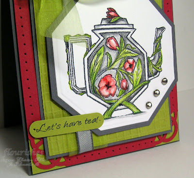
On this next card I just used one of the beautiful tea pots from the Let's Have Tea set.  I just love this tea pot because it has such a unique shape, and a very Asian feel to it, so I went with an Asian feeling design.

This is also colored with Prismacolor pencils.  I used the Martha Stewart Rings Corner punch and the Sizzix Texturz Plate for texture.   Isn't the blossom on the top of the teapot lid, and the vine wrapping around the spout delicious??? I just love how Lauren Pope illustrated this set. 


So if you want to win these gorgeous sets today....pop by the Flourishes Newsletter to enter. 

And for more delicious samples from the Design Team, see this lovely ladies blogs:  Cindy Lawrence, Laura Fredrickson, Julie Koerber, Leslie Miller, Latisha Yoast, Stacy Morgan

Recipes:  Friendship Tea Roses:  Stamps:  Flourishes - Let's Have Tea and Tea Rose Background Set;   Ink:  Memento Tuxedo Black, Tim Holtz Distress Ink - Tea Stain;  Paper:  Flourishes Classic White, Regal Rose, Creamy Caramel;  Accessories:  Prismacolor Pencils, Blending Stump, Flourishes Crochet Ribbon, Velvet Ribbon, Basic Grey 1/2 Pearls, Sewing Machine, Sponge, Dimensionals, Big Shot, Fancy Labels Die, Floral Accent Shapeabilities, Fleur De Lis Pendant Die, Corner Rounder Punch. 

Asian Teapot:  Stamps:  Flourishes - Let's Have Tea;  Ink:  Memento Tuedo Black;  Paper:  Basic Grey, Kiwi Kiss, Real Red, Flourishes Classic White;  Accessories:  Big Shot, Octagonal Nesties, Word Window Punch, Martha Stewart Rings Corner Punch, Piercer, Taffeta Ribbon, Organdy Ribbon, Dimensionals, Silver Brads, Sizzix Texturz Plate. 

Tuesday, February 9, 2010

Sneak Peek - From the Garden

Oooh it's Sneak Peek Week at Flourishes!  And we have something today that will absolutely get you in the mood for spring!  It's a beautiful new set illustrated by Marcella Hawley that uses a very sweet and whimsical style.  I know you will love it!  Today I have two cards to Peek for you!


We plant petunias every year at our house, they are hardy, can stand the sun, and you can get them in wonderful vibrant colors like these burgundy type ones I've colored here with copic markers.  I used an off center fram to accent the sponged and colored flowers and a great big beautiful silk bow.  The great thing about this stamp is that it's interchangeable to a number of different flowers you can put in the gardening pot.


Now here's another one that I made for my Mother-in-Law for her birthday.  This one has a bit of an eclectic homespun country feel. She spends so much time in the spring and summer in her very large garden and then does a lot of canning in the fall with all her produce.  So I think this will be well fitting. 


I watercolored this pretty little gardening scene to match these pretty Basic Grey Nook and Pantry papers.  I've given it a bit of sewing on the layers to tie that country feel in more. 


I've added two rows of velvety ribbon to make it feel rich. 

Now there's so much more fun to this set that you'll want to check out the Flourishes Design Team girls' creations to get an even better look:  Cindy Lawrence, Julie Koerber, Latisha Yoast, Laura Fredrickson, Leslie Miller, Stacy Miller 

Recipe: 
Plant Kindness:  Stamps:  Flourishes From the Garden;  Ink:  Memento Tuxedo Black, Old Olive;  Paper:  Old Olive, Basic Black, Rich Razzleberry;  SU Cottage Wall DSP, Flourishes Classic Ivory;  Accessories:  Big Shot, Blossom Nesties, Foliage Frame Nestie, Olive Silk Ribbon, Basic Gray Gems, Modern Label Punch, Corner Rounder, Dimensionals, Copic Markers (Petunia Collection, Evergreen Collection, and Warm Neutrals Collection), Sponge. 

Nurture Yourself:  Stamps:  Flourishes From the Garden;  Ink:  Stazon;  Paper:  Baja Breeze, Chocolate chip, Garden Green, Flourishes European Watercolor paper, Basic Grey Nook and Pantry DSP;  Accessories:  Big Shot, Labels 4 Nesties, Oval Nesties, Sewing Machine, Dimensionals, Reinkers, Aqua Painter, 1/2 pearls, Chocolate Velvet Ribbon, Velvet Ric Rac Ribbon. 

Saturday, February 6, 2010

I Will Sing!

Today I want to invite you to join us in the first week of Our Daily Bread Designs new Challenge Team Challenges called Shining the Light!  Yep, it's here!  This first challenge is a very timely one, perfect for the season of Love :)


Your requirements for this challenge?  To use hearts!  The hearts can be on your designer paper, in your image, on your embellishments (ribbon, pearls, gems, charms and etc.).  If you have ODBD stamps we'd love for you to use them, but if not, play anyway! 

On my Challenge sample, I incorporated two different kinds of hearts.  You can see the embossed heart tucked behind the sentiment, but if you look closely you can also see that the dotted i's in the sentiment are dotted with hearts. 

I love this image from ODBD, it's a set called Sing to the Lord, and the illustration and verses are wonderful.  This also fits with our sweet Betty's new challenge at ODBD, Stamping in Time.

The image is colored with copic markers, and I added extra blossoms and popped them up, I sponged the background of the main image with SU - Pale Plum ink.  The papers are Basic Grey Perhaps. 

So for more inspiration, you'll want to check out my team-mates beautiful Challenge creations:  Chris Olsen, America Kuhn, Francie Gumprecht, Natalie Dever, Patter CrossSabrina Jackson, and the Our Daily Bread Designs Blog

To make the challenge even more fun, we will be giving out a prize, a $15 gift certificate to be used toward stamps at the Our Daily Bread Designs store!! Entries for the prize must be submitted by Thursday, February 11. One random winner will be chosen and announced next Saturday. As a way of recognizing those who do use Our Daily Bread Designs stamps, we will also be choosing 1 to 2 creations to spotlight for our Shining the Light Award. In order to qualify for this award, however, you must use Our Daily Bread stamps and have your submission added to Mr. Linky by February 11 at 8 p.m. EST.

If you upload your creations to Splitcoast Stampers or any other online gallery, please use the keyword is ODBDSLC1. When creating your posts on blogs please include a link to the challenge.

Recipe:  Stamps:  ODBD - Sing to the Lord;  Ink:  Memento Tuxedo Black, Pale Plum;    Paper:  Bravo Burgundy, Regal Rose, Old Olive, Gina K Pure Luxury White, Basic Grey Perhaps DSP;  Accessories:  Big Shot, Rectangle Nesties, Scalloped Rectangle Nesties, Scallop Trim Border Punch, May Arts Ribbon Dotted Chenille Ribbon, Sewing Machine, Copic Markers, Basic Grey 1/2 Pearls, Dotted Heart Embosslit, Dimensionals, Sponge

Thursday, February 4, 2010

What's Your Cup of Tea?

Well, my sweet friend Julie has issued us Flourishes girls a fun Pre-Release Challenge next week you get to see the fabulous February Sneak Peek releases!  So our theme today is "What's Your Cup of Tea?" here's the explaination..

"Let's be inspired by the containers of some of our favorite kinds of beverages! Can't live without your daily grind or brew? Look at the label and be inspired by the color or layout of the package. Crave your daily Diet Coke? Use silver and red as a color challenge for your card! The sky is the limit with this challenge - so grab your favorite drink and let that creativity flow!"

What's funny about this - is that if you know me, you'd be expecting something red and white, because my absolute favourite drink in the WORLD is Coca-Cola ...sigh...what a dreamy drink...I can just imagine it's cool sweetness and bite running down my throat right now...

Whoa...ok back to reality.  As of January 1st, my sweet husband has given up pop or soda for a year.  And to support him, I've said I'll give up pop for 4 months, to start with, if I can do that I'll commit to longer.  SO, it's water for me, and if it's really a special occassion, I'll have water with lemon.  :)

So here's Water with Lemon

I went really soft and pastel with this watercoloring of this beautiful Life Love and Lemon's set , totally inspired by the gorgeous Lily Kate Basic Grey Paper.  I used my Labels One Nestie and a tiny bit of out of the box technique with the leaves.  I tried to give you the feeling of water in the background by washing in some very soft Bashful Blue. 


I overstamped the sentiment with one of the solid stamps from the set and added gingham ribbon and pearls and some piercing as accents, as well as a bit of fancy piercing, and a fancy Shapeabilities as the crowning touch. 

Cool and refreshing :)  And no calories!  You'll want to stop by the Design Teams' Blogs today to see their Beverage inspired creations!  Julie KoerberLaura Fredrickson, Latisha Yoast, Leslie Miller, Stacy Morgan.

So join us!  With our sneak peeks and February Release just around the corner, how would you like to win all 3 new sets in the this release?? Join us for our "What's Your Cup of Tea?" Challenge!  Deadline:  You can play until Friday February 12th at 5 PM Eastern and be sure to click on the Flourishes Newsletter to link up your creation to Mr. Linky! If you upload to SCS, please use the keyword: FLLCFEB10


Recipe:  Stamps:  Flourishes Life, Love and Lemons;  Ink:  Stazon Black, Barely Banana;  Paper:  Bashful Blue, Certainly Celery, Barely Banana, Flourishes European Watercolor paper;  Accessories:  Big Shot, Labels One Nestabilties, Circle Punch, Floral Accent Shapeabilities, Scallop Trim Border punch, Gingham ribbon, Basic Grey 1/2 Pearls, SU Stampin' Write Markers, Aqua Painter, Dimensionals, Martha Stewart Rings Corner Punch, Ornare Piercer, Ecstacy Piercing Template.

Wednesday, February 3, 2010

Favourite Flourishes Set

This last card I've made for the Flourishes Timeless Tuesday Celebration was Maki's Favourite Flourishes Set (FTTC52F).  I really have a hard time choosing what would be my Fav Flourishes set, I have so many!  And each month I add to my list of fav's!  But...today I decided to go back to an old favourite the Tulips set called Thank You.  It incorporates everything I love about Flourishes, gorgeous realistic illustration, lots of space to color, a background is even included and beautiful sentiments. 


I love the contrast between the deep oranges and the turquoise.  I watercolored the tulips with my SU Stampin' Write Markers on Flourishes European Watercolor paper.  I paired the tulips with K & Co Que Sera paper which really ties the colors together, using the Labels Four Nesties, Lattice Borderabilities,  and Fancy Labels Die


Back tomorrow with a Flourishes Pre-Release Challenge!  Woo Hoo! 

Recipe:  Stamps:  Flourishes - Thank You;  Ink:  Black Stazon;  Paper:  Only Orange, Tempting Turquoise, Flourishes European Watercolor Paper, K & Co Que Sera DSP;  Accessories:  Big Shot, Labels Four Nesties, Fancy Labels Die, Lattice Borderabilities, Dimensionals, Stampin Up Stampin' Write Markers, Aqua Painter, Tempting Turquoise Grosgrain Ribbon, Tempting Turquoise Brads.